Reports overview
What each report shows and how to filter, compare and share them.
By the end of this page you'll know which report answers which question, and how to slice any of them by date, channel, treatment, location or team member.
Finding your way around
Open Reports in the sidebar. The hub lists every report by category, each category under its own coloured icon and each report with a one-line summary of what it shows. A Filter reports box understands typos and synonyms ("no show" finds Attendance); the sidebar groups reports into nine categories that expand to their reports, with the current report's category open.
In the clinical workspace, Reports in the sidebar shows the Money, Appointments, Value & retention and Clinical reports and, at a UK practice, NHS contract.
Every report ends with How it's counted. Click it to read exactly what the report counts: which records, on which date, and how a later correction shows.
Every report is built from the same blocks:
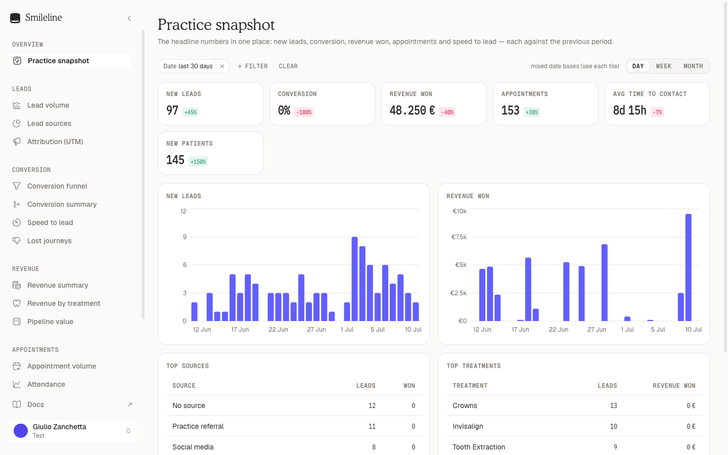
- KPI tiles — each headline number is compared against the preceding period of equal length.
- Charts — trends and breakdowns, often split by channel or another dimension.
- Breakdown tables — the per-source, per-treatment or per-person detail behind the charts.
Favourites
Click Add to favourites on a report to keep it, with the filters and time grain you have set, at the top of the reports page under Favourites. Give it a name, and owners and managers can tick Share with the practice so everyone who can see reports finds it in their favourites too. A favourite keeps the report and its filters, never its figures: opening it runs the report afresh.
A favourite opens the report's own page, so it only opens for someone who may see that report, and a report your practice's country doesn't have is never listed. Remove a favourite with its bin icon; you can remove your own, and owners and managers can remove shared ones. When you have many favourites, More shows the rest.
The reports
Overview
| Report | What it answers |
|---|---|
| Practice snapshot | The headline numbers in one place: new leads, conversion, treatment revenue, appointments and speed to lead — each against the previous period |
| SEO weekly digest | Local visibility, tracked search leads and value, completed SEO actions, current recommendations and retained wins |
| Ads weekly digest | Weekly ad spend and platform-reported results next to CRM truth: cost per lead and per booking, where each platform's spend and bookings go, each platform's patient journey, why leads are not proceeding, every campaign and ad group, and who booked (needs the SEO & Ads add-on) |
| Call insights weekly digest | Last week's Call AI summary and headline call numbers, as emailed every Monday (Smileline Voice, UK and US practices) — see Call insights |
Leads
| Report | What it answers |
|---|---|
| Lead volume | New treatment enquiries over time, split by channel |
| Lead sources | Where enquiries come from: channel mix, top sources and how each source converts |
| Attribution (UTM) | Marketing touches by UTM source and campaign, with the journeys, go-aheads and revenue attributed to each first touch |
| Calls | Inbound calls answered against missed, over time and by hour, ring time, the UTM source / campaign / keyword behind each call, calls per team member and the missed calls nobody rang back — see Calls |
Conversion
| Report | What it answers |
|---|---|
| Conversion funnel | How many journeys from the selected cohort reach each stage of the pipeline, stacked by channel |
| Conversion summary | Per treatment: enquiries received → contacted → booked → attended → going ahead, with conversion rates |
| Speed to lead | How fast enquiries get their first contact: averages, distribution and per-owner response times |
| Not proceeding | Journeys marked not proceeding: trend, reasons and the stage they closed from, with the potential value that walked away |
| Call insights | What Call AI learned from your analysed calls: booking rates, objections, why calls didn't book and who can fix it, and for owners and managers a written summary of each week (Smileline Voice, UK and US practices) — see Call insights |
Revenue
| Report | What it answers |
|---|---|
| Revenue summary | Value of journeys going ahead over time — confirmed vs estimated — plus deal counts and average deal size |
| Revenue by treatment | Which treatments the revenue comes from |
| Pipeline value | The value currently sitting in the open pipeline by stage, raw and probability-weighted |
Value & retention
| Report | What it answers |
|---|---|
| Patient value | What a patient is worth over their life, whether that value compounds, and which sources bring the valuable ones |
| Patient retention | Whether patients come back after the treatment they came for, how long they take, and who has stopped coming |
| Recall success | Of the recalls that fell due each month, how many are booked or done — against a 70% goal |
The first two work differently from every other report — see Patient value and retention, which also explains Recall success.
Appointments
| Report | What it answers |
|---|---|
| Appointment volume | Appointments taking place over time, by status |
| Attendance | Show rate, no-shows and cancellations — overall, over time, by appointment type and for first visits |
A visit moved to another time, an online booking the patient never paid the deposit for, and a visit booked by mistake are not appointments in either report — not as cancellations and not in the totals. A patient who moves their visit twice and then cancels it counts one appointment, cancelled once.
Team
| Report | What it answers |
|---|---|
| Team activity | Outbound calls, messages and completed tasks per team member |
| Team conversion | Per owner: leads worked, contact rate, go-ahead rate and revenue from their cohort |
| Practitioner performance | Journeys, conversion and treatment revenue per practitioner |
Money
Every money report reads the patient ledger in the practice currency — see Money reports.
| Report | What it answers |
|---|---|
| Day sheet & takings | What was charged and taken by day, takings by payment method, refunds, discounts and write-offs, per location |
| Aged debt | What every account owes today, aged from each charge's date, plus unallocated credit |
| Production | Charges raised over time by source, per practitioner and location |
| Collections | Cash in and refunds out by payment method and source, and the collection rate against production |
| Associate pay | Per practitioner: production, cash allocated to their charges, and what is still outstanding |
| Chair utilisation | Appointment time booked and attended against the hours each practitioner's rota makes bookable |
| Sundries | Goods sold on retail codes, by code, and manual charges one by one |
| Invoices | Invoices and credit notes issued, what's been paid in cash or settled by credit, and what's still owed; charges with no tax rate |
Clinical
Counted from the clinical record — see Clinical reports. Their rows name patients for people who can see patients, and each page of rows is recorded as a clinical read.
| Report | What it answers |
|---|---|
| Radiograph audit | UK only: the share of x-rays justified and evaluated, and the quality-grade split, by operator and type |
| Perio coverage | Probing exams, the sites assessed of those eligible, and the average bleeding and plaque scores |
| Treatment completed | Completed treatment by code, clinician and site |
| Lab turnaround | Days from sent to received and fitted, by lab |
| Prescriptions issued | Prescriptions issued, by prescriber and kind |
| New patients | Patients' first visits on a new-patient code, by site and clinician, beside the patients registered |
| Referrals | Referrals out and in by kind, recipient, referrer and status, beside the patients and charges each referrer brought |
NHS (UK)
At a UK practice the clinical workspace's Reports adds an NHS card, for roles that can see both reports and NHS data. A practice in another country does not see it, and the API refuses its NHS requests.
| Report | What it answers |
|---|---|
| NHS contract | Pick a contract to see its year's UDA activity (awarded, in flight and forecast) against the target, overall and per performer — see Activity |
Filtering
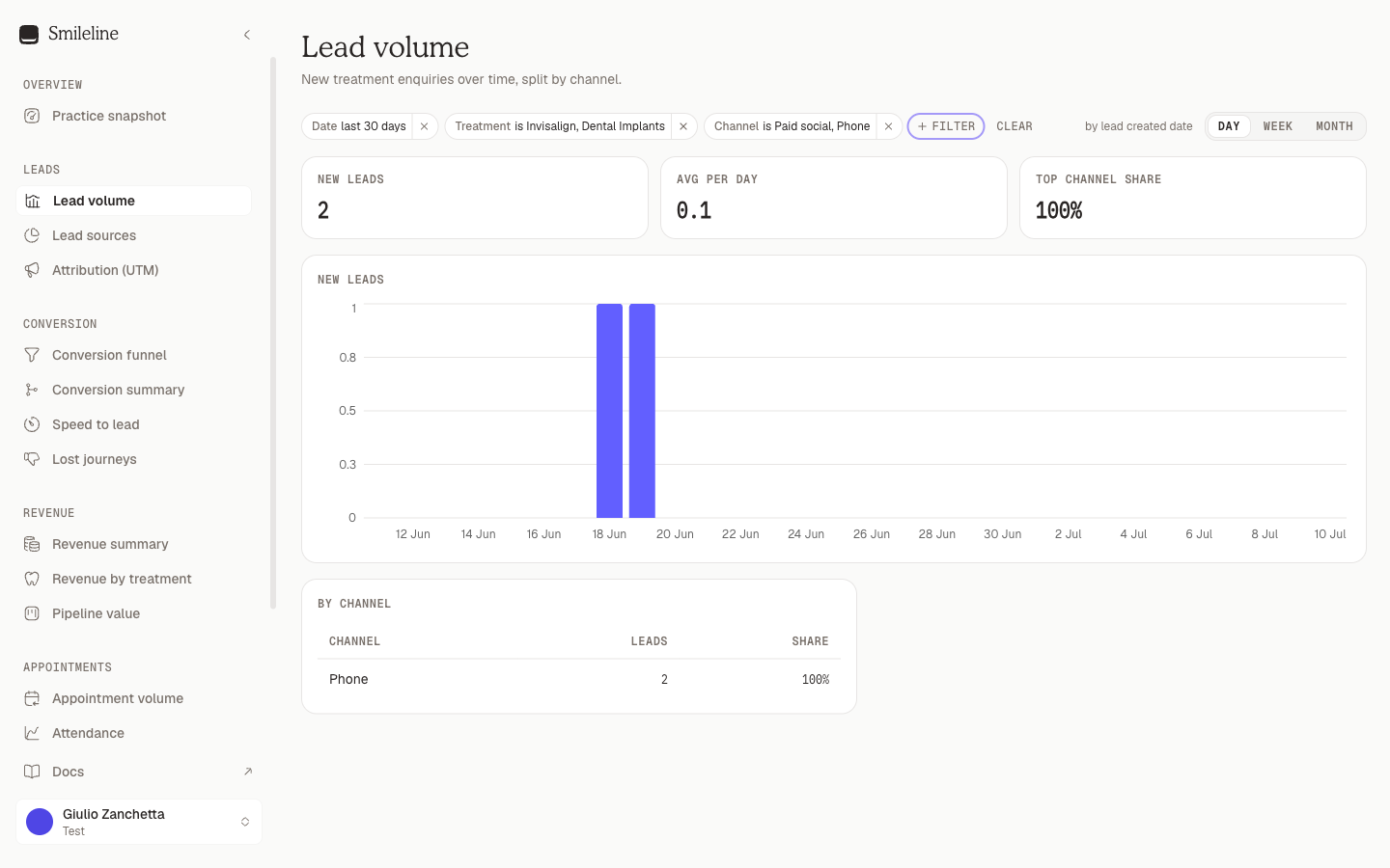
The chip bar at the top of every report offers the filters that report honours — up to: Date, Board, Treatment, Channel, Lead source, Location, Owner and Practitioner. Click a chip, pick values, and the report reloads.
Things to know:
- The date window defaults to the last 30 days, in your practice's timezone. Clearing the date chip returns to that default. Patient value and Patient retention open on the last 24 months instead — they need years to say anything — and Recall success on the last 12 months.
- Each report states its date basis next to the filter bar — "by lead created date", "by close date", "by appointment date" — so you know which date the window slices on. Cohort reports follow journeys created in the window wherever they end up.
- Pipeline value is point-in-time — it shows the pipeline as of now, so the date filter doesn't apply.
- Filters live in the URL. Copy the address bar to share the exact slice you're looking at; it survives reloads.
- Rows that name patients load a page at a time. In the clinical reports, Sundries and Invoices, the table of rows shows the newest first; click Load more for the next page until every row has shown. They show only to people who can see patients.
Time grain
Reports with a timeline offer a Day | Week | Month toggle above the charts. Weeks start on Monday. Reports without a trend chart don't show the toggle, and the two cohort reports and Recall success are always monthly — a cohort row, like a month of recalls falling due, is a calendar month by definition.
Comparisons
Every KPI tile shows the change against the preceding window of equal length — a 30-day window compares to the 30 days before it. Some tiles have no comparison (point-in-time values and derived rates); those show the value alone.
On the two cohort reports most tiles deliberately show no comparison, because a cohort keeps earning after you measure it and comparing a young one against an older one would always flatter the older. Patient value and retention explains which tile does compare, and why it's the only fair one.
Bookings on the dashboard
The dashboard's Bookings made tile, its trend line and the Team leaderboard count each appointment on the day it was booked, not the day it takes place. Cancelled and no-show appointments don't count.
- Booked in Smileline — by your team, online, through the API or by an automation: counted on the day it was created.
- Synced from your practice management system — counted on the day that system says it was booked. When the system doesn't say, the appointment isn't counted as a booking, so connecting a system never piles years of history onto one day. Open Dental records the booking date; Dentally's is when the appointment was created, or, when Dentally doesn't send that, when it went into Pending; CareStack's sync feed carries none.
- Imported from a file — counted on the file's Booked on column, and not counted when the file has none. See Import and export.
The leaderboard credits the team member who created the booking. Synced and imported bookings go to Unknown — never to whoever ran the import.
Bookings recorded without a diary appointment
If your diary lives in a system Smileline can't book into, you record the booking on Today (on the web or in the mobile app) by choosing They booked a consultation and giving the date — or no date at all. There's no appointment behind it, so the booking itself counts:
- It counts in Bookings made, the trend line and the leaderboard on the day you recorded it, credited to whoever recorded it.
- The lead counts as Booked in the funnel, the Lead → booked rate, the channel table and the lead flow.
- Undo removes it. If you book again on another date, it still counts once.
- Answering its attendance question with They didn't turn up removes it. Only that booking is removed: a patient who attended one consultation and missed a later one still counts once.
- When the appointment later reaches Smileline from your practice management system, the appointment replaces it, so the booking is never counted twice. That happens only when it's the patient's only appointment on the consultation day, on that lead or on no lead. If there are two that day, Smileline can't tell which one it was, so the booking stays as it is. An appointment on a different day doesn't replace it.
- A booking made without a lead counts in Bookings made but not in the funnel, and not when a filter is set: filters apply through the lead.
Bookings made counts bookings when they were made. The funnel's Booked counts the leads that came in during the period and have booked at any time since. Over the same dates, the two numbers can differ.
The ads reports — the Ads Overview, including its All campaigns and By location views, and the Ads weekly digest — count these bookings too.
Contacted by and the leaderboard
The lead flow's Contacted by column shows the first team member who worked each lead. Calls, texts, emails and outcomes recorded on Today all count, whether or not the patient answered. A person always takes priority over an automated message. If a lead has only been contacted automatically, it shows under Automation (sequences and campaigns) or AI. Not contacted yet means nobody and nothing has reached out. This isn't the same as the dashboard funnel's Leads we spoke to step, which only counts leads someone actually got through to.
In the Team leaderboard, Leads worked counts people, not attempts: three calls and an outcome for the same patient count as one lead. It counts everyone a team member reached out to during the period, whether or not they answered and whenever their lead came in. The dashboard funnel shows the same people beside Leads we spoke to, as leads we tried to contact, counting someone once even when two team members worked them. Leads we spoke to only counts leads that came in during the period and that someone got through to, so the two numbers can differ. The percentage is the share of those leads who booked after that team member first contacted them, so it never goes above 100%. Booked counts the bookings each person made. The leaderboard always covers the whole practice, even when you filter the dashboard.
Click a name in the leaderboard to see what that person did over the same dates. It's the same view as the calendar's Team tab:
- Their counts of calls, messages, emails, outcomes, stage moves, notes and anything else.
- Their activity by hour.
- Everything they did, newest first. Each entry names the patient it was for and links to their record.
You need permission to see patients to open it. Unknown can't be opened, because it isn't one person.
Response time on the dashboard
The Avg response time tile shows how long your team takes to reach out to a new lead. The clock starts when the lead arrives and stops the first time a team member works it: a call, text, email or WhatsApp, or an outcome recorded on Today. It stops whether or not the patient answers, just like Contacted by.
- Automated messages (sequences and campaigns) and the AI don't stop the clock. Only a person does.
- Leads nobody has contacted yet aren't counted. The funnel's Leads we spoke to step shows how many leads are still waiting.
- Time runs around the clock, so a lead that arrives overnight counts the hours until the morning.
- 99% within under the average is the 99th percentile: all but the slowest 1% of leads were contacted within that time. It shows how long your slowest leads waited, where the average can hide them.
The tile covers the leads that came in during the period, and a lower number than the previous period shows in green. In the Team leaderboard, Avg response under each name is the same average for the leads that person contacted first.
Schedule an email digest
Open the report and click Schedule email. The subscription keeps the current report, filters and time grain, and sends a compact digest with a signed-in link back to the live report.
Choose a recipient, timezone and a daily, weekly or monthly schedule. A digest carries the report's totals and its first summary table, never rows that name patients. Team managers can schedule for another member who still has report access; other report viewers can schedule only for themselves. Send test queues a one-off digest without changing the next scheduled run.
You can pause, resume, edit or delete a subscription from the same dialog. Smileline recalculates wall-clock delivery across daylight-saving changes and can retry a recent delivery failure without sending a burst. It does not send reports that fell due while the practice subscription was stopped. Delivery failures are recorded against the subscription and the most recent error is shown in its dialog; a run of failures never switches the subscription off on its own, so a provider outage cannot silently end a practice's reporting.
Delivery history and Replay
Click Deliveries beside a subscription in the dialog to see every delivery attempt — sent, waiting or failed — newest first. Narrow it by Status and click Load more to continue; nothing is dropped from the history. Each delivery shows the occurrence it was for, its kind, state, generation and error; open Details for the period it covered, the attempt count, the delivery it replays, when it was sent and the email provider's message ID.
A failed delivery, or one still waiting after its retry window closed, shows Replay. Replay queues a new delivery at the next generation that points at the failed one, which stays on record unchanged; the new delivery appears at the top and the deliveries already loaded stay. If Smileline refuses the replay, for example because the delivery was sent meanwhile, the row says so and stays listed. If the history can't be read, it says so with Retry.
The same history is in the API: GET /report-subscriptions/{id}/deliveries
lists it a page at a time by an opaque cursor, and
POST /report-subscriptions/{id}/deliveries/{deliveryId}/replay replays one.
If a recipient leaves the practice, Smileline disables their subscription and clears the recipient before removing their team membership. Past delivery history remains available to managers, but no further digest is queued until a manager selects a current team member and re-enables the subscription.
Create reviewed SEO content
Pick a suggested topic, write it with research and AI help in the editor, request clinical review and export the approved article.
Calls
Inbound calls on your numbers — answered against missed, ring time, which campaign and keyword the callers came from, who took them, and the missed calls nobody rang back.